
You have a plain white slide. You know it’s boring. So why are you presenting plain white slides? Oh, you have a photo on it? That’s cool. It’s just a square on the side with some bullet points? Ok, so what you’re trying to say is you struggle with design. Or maybe you think it takes too long. That’s my favorite excuse. You can’t improve the look because it would take time and effort. Please stop living up to the Millennial stereotype… for me… please, regardless of your age.
Point is, you have lots of excuses. Check out my post on Themes to see how you can make your slide a bit more interesting. If none of the Themes jump out at you (or maybe you already have a theme, and the slide is still boring or simply doesn’t work for you visually), either head to the Design ribbon or stay on the Home ribbon, and under the Designer group, click on Design Ideas. Yes, it’s found in both places under the same group.
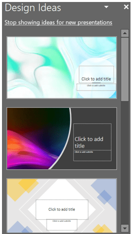
This will open the Design Ideas sidebar, which may also open automatically on its own. Even if you don’t have any content populating, the slide PowerPoint will still make suggestions.
So, let’s walk through an example. Say we have this slide.
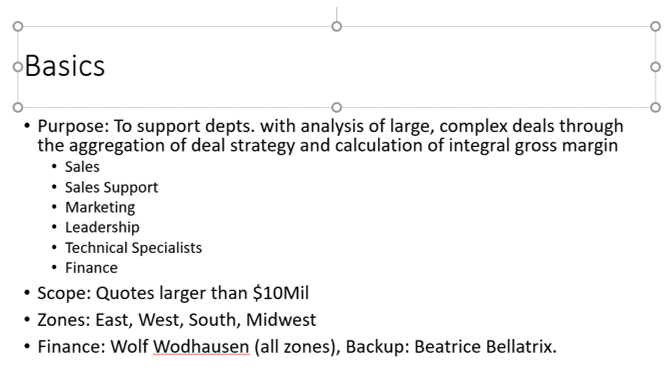
Boring, right? Also, a lot of info. Opening Design Ideas will generate suggestions.
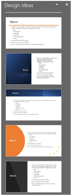
There’s more if you scroll down. As there’s so much info on that slide, let’s create a duplicate of the slide so we don’t lose info when edit. For now, let’s remove the sub-bullets.
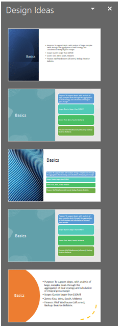
Getting better. Let’s be a little more extreme and get rid of the definitions, too. Now things are getting more interesting.
Remember, you don’t have to put all your info on one slide. Sometimes doing so will overwhelm your audience. Your presentation isn’t about you communicating; it is about your audience’s understanding. Putting too much info on one slide may be convenient, but it’s not worth compromising audience engagement or understanding. With the options offered, we can create Action buttons (I’ll post at another time how to build these) for interactivity or put the long explanation on the following slide(s) to drive home our message in an effective manner. If you give people a bunch of text, what happens? They zone out.
For this example, we’re choosing the first option because it’s the most graphic.
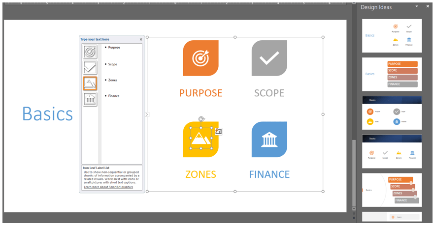
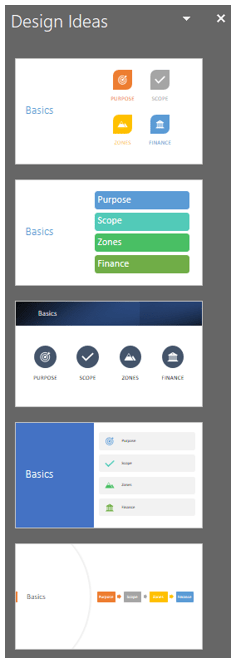
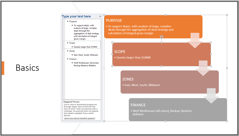
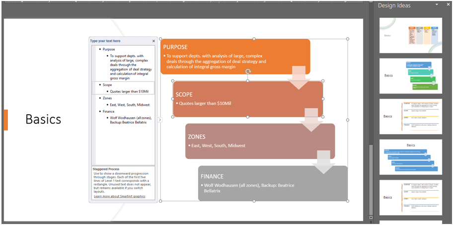
You’ll notice a few things here. First, the system has taken my text and created SmartArt. Second, the options under Design Ideas have changed again giving us even more options. The fifth option down allows us to include our definitions from earlier on this slide. You don’t have to stick with the first choice you made. Select another option (we’ll take the fifth option) and place our definitions as sub-bullets. Now, we’re getting warmer.
We can either look back at Design Ideas for further changes…
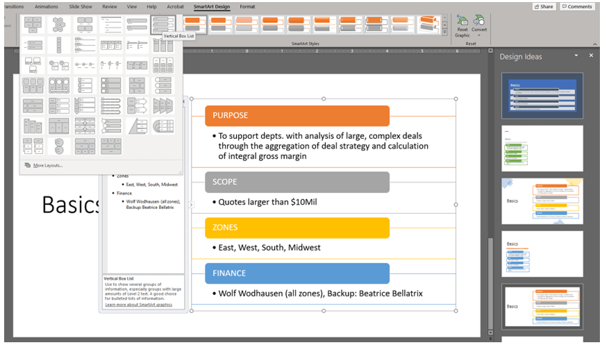
…or go to SmartArt and change the layout of the art. Play with this. Mess up. That’s the essence of creativity.
This example took the long way around to get to the design, but it still only took about a minute to turn a boring slide into something visually interesting. It definitely took you longer to read and follow, but that action only took about a minute in real life. If we had started with sub-bullets or a vague idea of what we wanted, it would have taken seconds. Stop with the mindset that “pretty” takes time; it takes a modicum of effort to ensure your audience is paying attention, grasping concepts, and not immediately disengaged by your slides.
